type
Post
status
Published
date
Mar 2, 2023
slug
seaborn
summary
seaborn时序数据可视化
tags
可视化
category
学习思考
icon
password
URL
数据可视化在机器学习中是一项关键技术,它可以帮助我们更好地理解数据和模型的行为,并支持我们在模型选择、调整和解释过程中做出更加明智的决策。
时序数据可视化
时序数据比较常用的是二维的折线图,下面用 seaborn 折线图可视化。
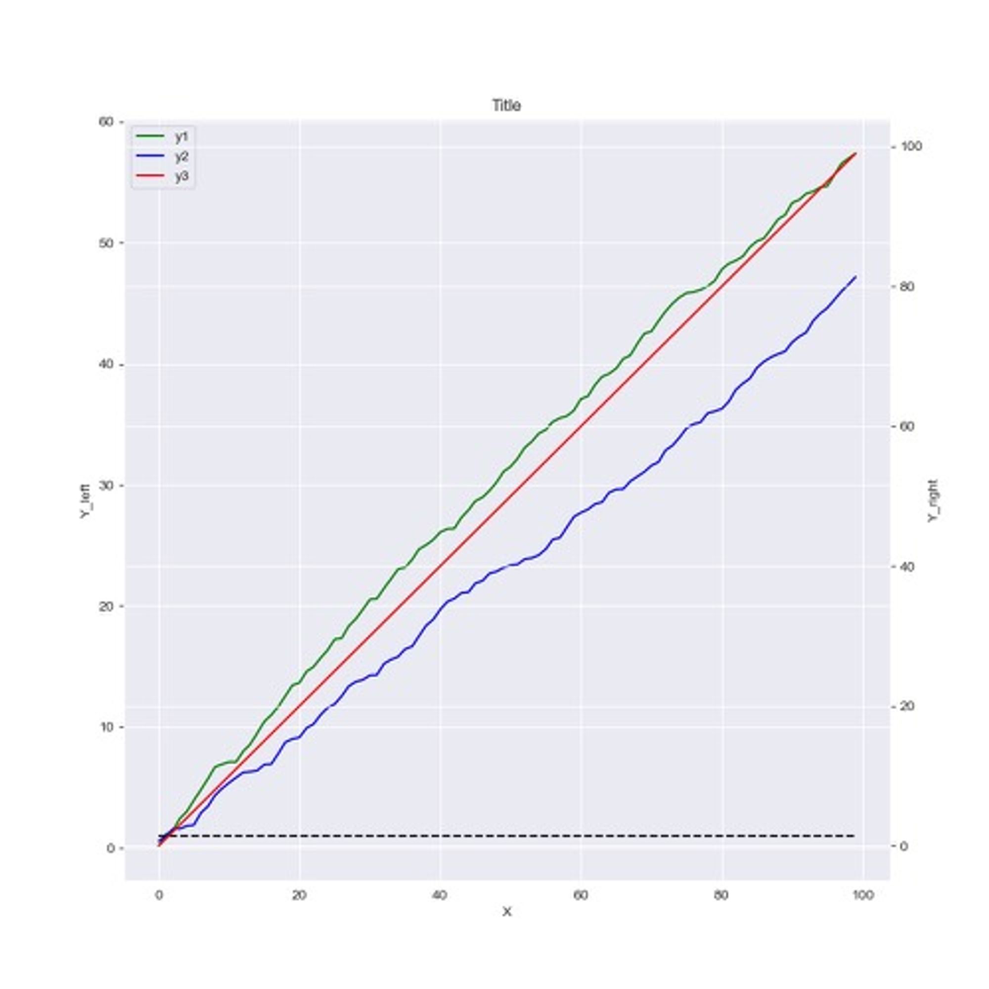
from typing import List
import seaborn as sns
import matplotlib.pyplot as plt


def plot_lines(x: List[float], y1: List[float], y2: List[float],
               y3: List[float], show: bool = False, save_path: str = None):
    """
    画图,双Y轴
    :param y1:
    :param y2:
    :param y3:
    :param show:
    :param save_path:
    :return:
    """
    sns.set_style('darkgrid')
    assert len(y1) == len(y2) == len(y3)
    fig, ax = plt.subplots(figsize=(10, 10))
    sns.lineplot(x=x, y=y1, label='y1', color='green', ax=ax)
    sns.lineplot(x=x, y=y2, label='y2', color='blue', ax=ax)

    ax.hlines(1.0, x[0], x[-1], colors="black", linestyles="dashed")
    ax2 = ax.twinx()
    sns.lineplot(x=x, y=y3, label='y3', color='red', ax=ax2)
    lines_1, labels_1 = ax.get_legend_handles_labels()
    lines_2, labels_2 = ax2.get_legend_handles_labels()

    lines = lines_1 + lines_2
    labels = labels_1 + labels_2
    ax2.legend().remove()
    ax.legend(lines, labels, loc='upper left')

    ax.set_xlabel('X')
    ax.set_ylabel('Y_left')
		ax2.set_ylabel('Y_right')
    ax.set_title('Title')
    if show:
        print('showing plot...')
        fig.show()
    if save_path is not None:
        fig.savefig(save_path, bbox_inches='tight')


if __name__ == '__main__':
    import numpy as np

    n_sample = 100
    x = list(range(n_sample))
    y1 = np.random.random(n_sample)
    y1 = np.cumsum(y1)
    y2 = np.random.random(n_sample)
    y2 = np.cumsum(y2)
    y3 = list(range(n_sample))
    plot_lines(x, y1, y2, y3, show=True)
代码解析:
- 第一步:在图上画出绿色和蓝色线,并用
hlines画一条 y = 1.0 的黑色橫虚线。
fig, ax = plt.subplots(figsize=(10, 10))
sns.lineplot(x=x, y=y1, label='y1', color='green', ax=ax)
sns.lineplot(x=x, y=y2, label='y2', color='blue', ax=ax)
ax.hlines(1.0, x[0], x[-1], colors="black", linestyles="dashed")
- 第二步:在图上新建一个 y 轴坐标在右边的 axe,并画线
ax2 = ax.twinx()
sns.lineplot(x=x, y=y3, label='y3', color='red', ax=ax2)
- 第三步:合并 ax 和 ax2 的图例
# 得到两个 axe 的线和坐标
lines_1, labels_1 = ax.get_legend_handles_labels()
lines_2, labels_2 = ax2.get_legend_handles_labels()

lines = lines_1 + lines_2
labels = labels_1 + labels_2
# 把 ax2 的图例线去掉,不然左上角会重复出现 y3
ax2.legend().remove()
ax.legend(lines, labels, loc='upper left')
如果我们把 x 轴的数据替换成 datetime 对象,则效果如下
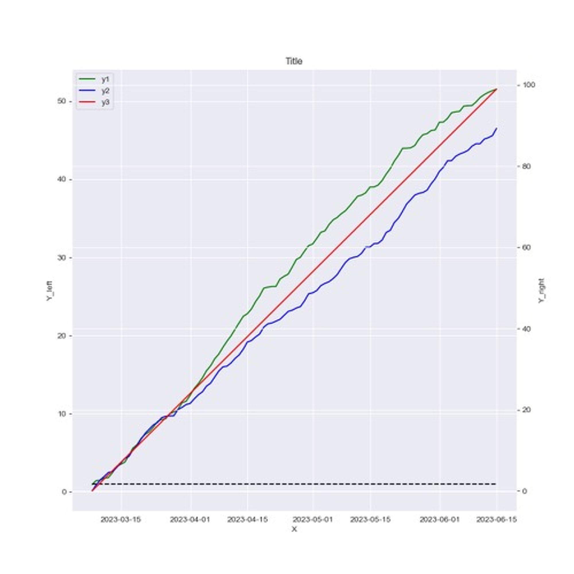
if __name__ == '__main__':
    import numpy as np
		import datetime
    n_sample = 100

    x = list(range(n_sample))

		base = datetime.datetime.today()
    x = [base + datetime.timedelta(days=x) for x in range(n_sample)]

    y1 = np.random.random(n_sample)
    y1 = np.cumsum(y1)
    y2 = np.random.random(n_sample)
    y2 = np.cumsum(y2)
    y3 = list(range(n_sample))
    plot_lines(x, y1, y2, y3, show=True)
- 作者:Ross
- 链接:https://ross.selfcoding.cn/article/seaborn
- 声明:本文采用 CC BY-NC-SA 4.0 许可协议,转载请注明出处。